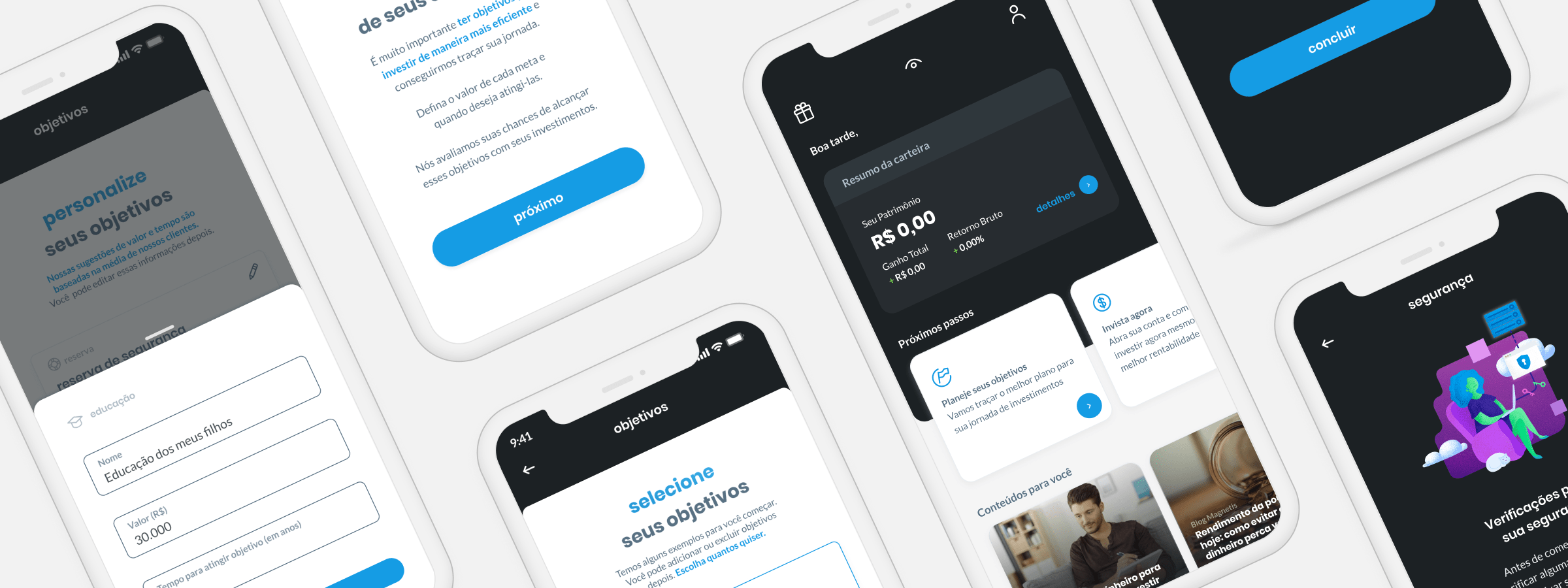
acquisition funnel
Company
Magneits Investments
Timeline
june 2020 |
october 2020
Role
Product Designer
Problem space
At Magnetis, we had great complexity regarding the acquisition flow. It was our oldest flow and therefore had several legacy problems that made the experience difficult. We also had many questionnaires thar the user had to go through, such as creating a user, suitability to define investment profile and others, and a last we had also been focusing on strengthening and consolidating our flow in-app, which was our highest converting channel proportionately. These issues generated a flow where the user would have to go through more than 40 questions to be able to see the product, with a lot o different experiences throughout it, and after all of it have the opportunity to see if the value it delivers is what they were looking for.
Exploration
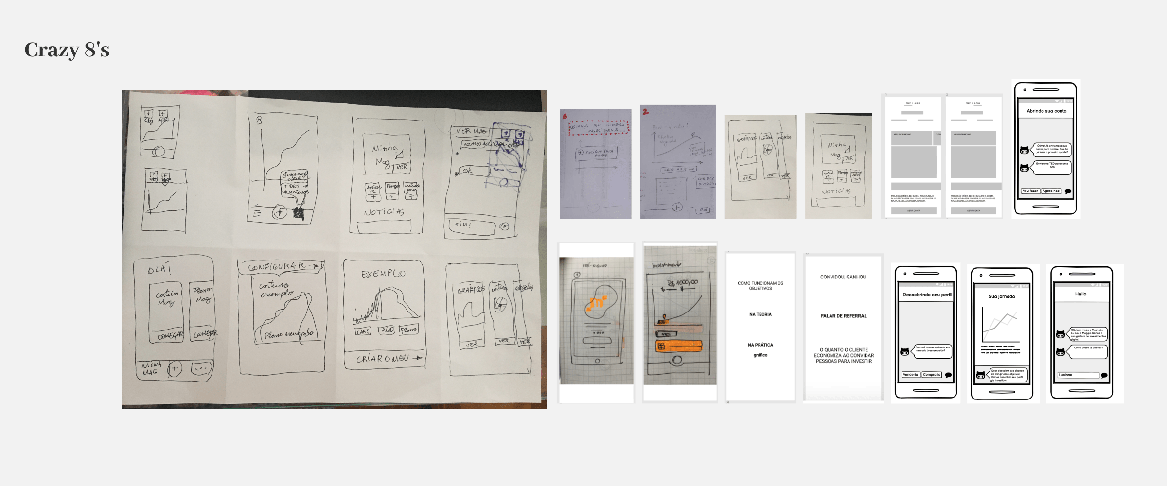
One of our main questions was how to bring more of our product into the acquisition flow. For this, we made a series of dynamics with our design and product chaptes, such as crazy 8's, userflows, and other discussions to define the basis of our acquisition, delivering value after a few steps in the best way possible, and showing our users the product's possibilities for him to proced with the opening account process.
Solution
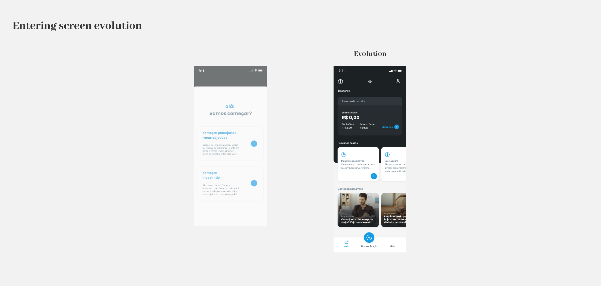
Our first solution was to take the user to the main screen after creating a login, and from this screen encourage the user to move on to the next steps. But although this screen worked very well for users used to the product as we saw in tests performed by another squad, it did not serve the objective of informing the user the options that he had to continue the acquisition flow, as the focus of this screen is the user's financial journey and has several complexities of its own. So we settled with another proposal, that began with an initial screen that served to highlight the opening account options and services that we offer, andthe user could define wich flow suits his needs better. This screen would also bring the possibility of diversifying our products, offering at this entrance point other types of products that we might have in the future, such as content related to finances as a whole.
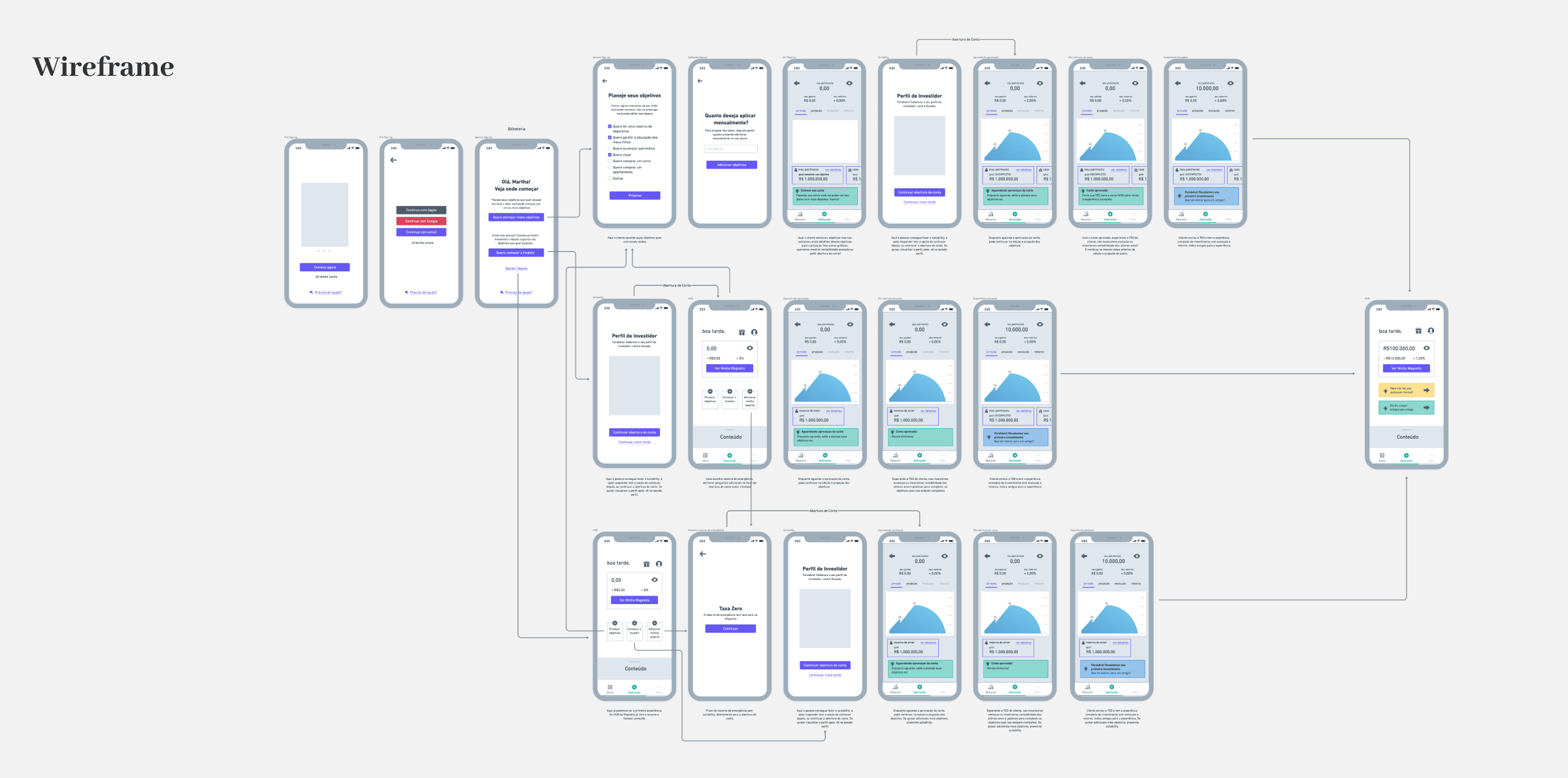
So I designed the final three flows that were validated with users in a usability test:
- Learning more before proceeding: the customer would enter directly into the product, would have access to the interface, but to enter data and see his portfolio details and graphics, they would be taken to follow through the next step
- Creating goals: enter the product through the creation of goals, gaining access to the platform with data from a generic portfolio, being able to see how the graphics and investment portfolio, and then be taken to create an investor profile.
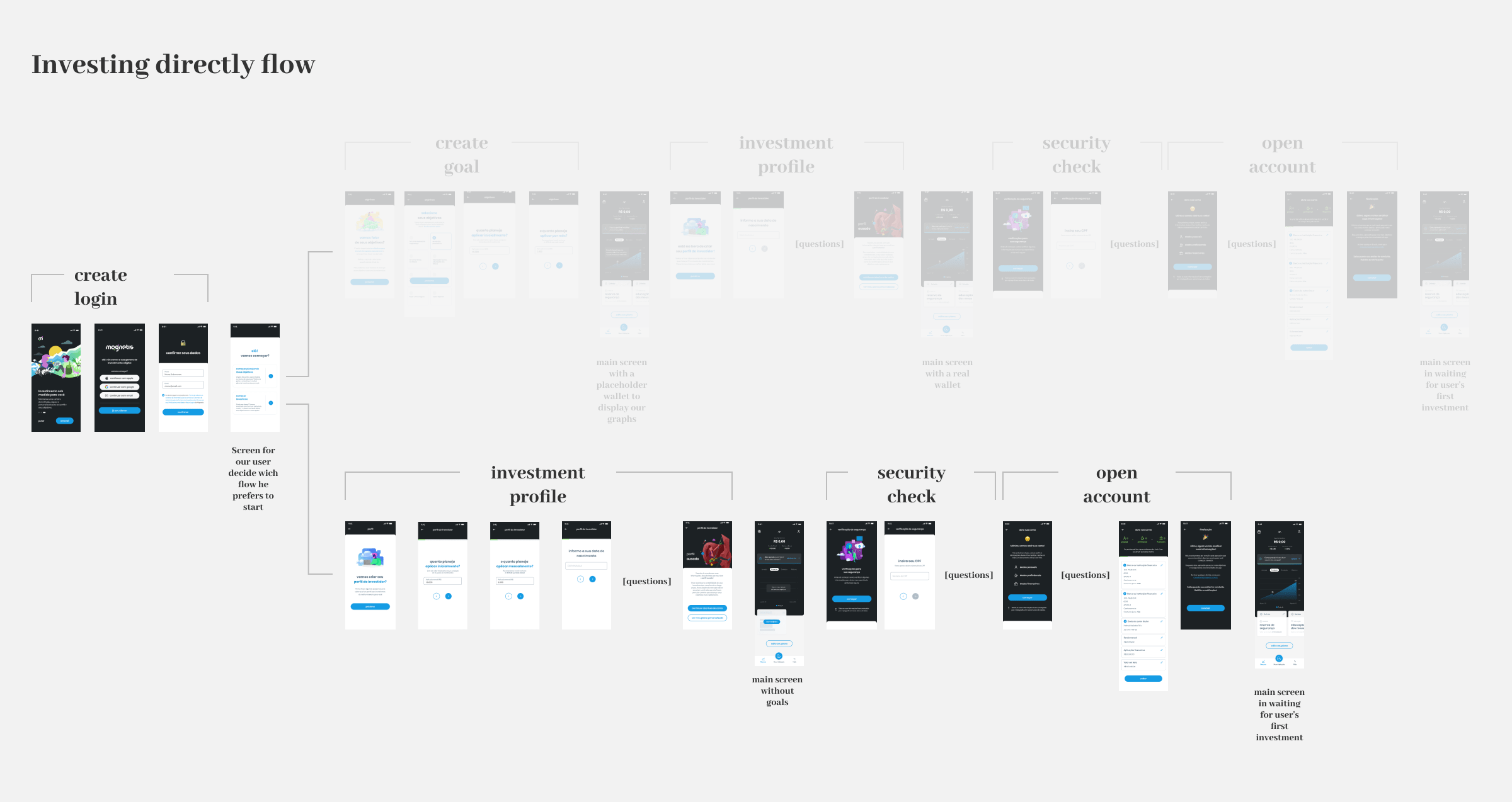
- Investing directly: here the user can skip creating goals and go straight to the creation of an investor profile, then be taken into the main interface with a simple objective and being encouraged to make the first investment, thus leading to the completion of the process with the opening account form.
Releases
So, me, the development team and the squad's PM, together we defined three main releases to deliver this new experience. The first release would adjust the flow we already had to the new ”creating goals” flow, which would consist of having a new questionaire to create only one main goal and versions of the app's main screen for each moment the user finish a step of the whole process.
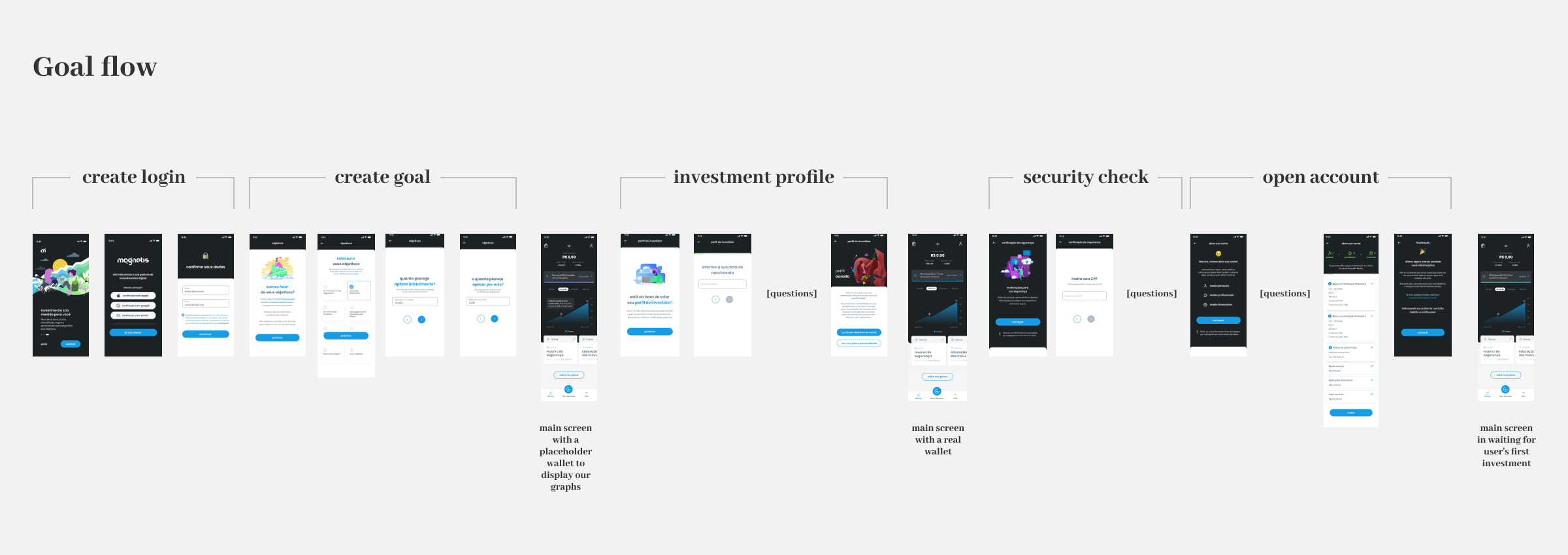
The second release was focused on creating our ”investing diretcly” flow, where the investment profile would be tailored to have two more questions that allow the product to work without setting goals. We also created a entering screen that gives the user the possibility to choose which way he wants to know the product. With this release setlled it would be easier to implement the last flow adding a link in this screen that would give a view or our main screen without users informations. For our final goal we wanted to put togheter an evolution of our entering screen that would serve as a way of entering our three flows and having other possibilities, such seeing financial news, or even meeting other new services that we could provide in the future.
Outcome
After the development of the first release, which was delivered along with the internal changes to the product, we had a new brand new app experience that was much more integrated and that solved our most essential issues in acquisition. This delivery alone has had an important impact on our conversion. At this moment I lived the team, but soon the second release was successfully developed and implemented, and most recently a version of the ”Entenring screen” evolution was implemented. The project brought significant improvements in the acquisition flow, especially bringing options for the user to feel comfortable in starting an account opening process or understanding more of our product beforehand, and the continuity of the implementation even after my departure shows the solidity of the designed solution. Finally, the evolution of the input screen proved to be a plausible and essential future vision for the product for us to bring more information about the product and the possibility of offering more services.